


A Way In: Color as an Obsession and Muse
Everyone loves the star of the show!


Having had a wonderful and successful trip to Los Angeles, I am back working on the studio build, teaching, and am right back to painting.
You may have seen my post about working through influences or seen how I am processing the trip to Italy and particularly my time at the Uffizi Gallery. As I finished the work to take to the Art Fair in LA, my palette suddenly deepened, and I fully leaned into the impressions left on my psyche from Florence.
It was interesting (as always) to see how people respond to my work when they see it in person. To hear people tell me the work is beautiful is a compliment that touches my soul and is one I don't ever want to take for granted. What surprised me was that it was almost always followed up with …" and the colors!"
I don't think I have ever embraced my sense of color because I may have taken it for granted. Other times, I wrestled with the lush use of color by trying to pull the excitement level back to something more "liveable," which, even as I type it, comes across as dull. Everyone has a personal response to color; why should I deem one palette as more livable than another?
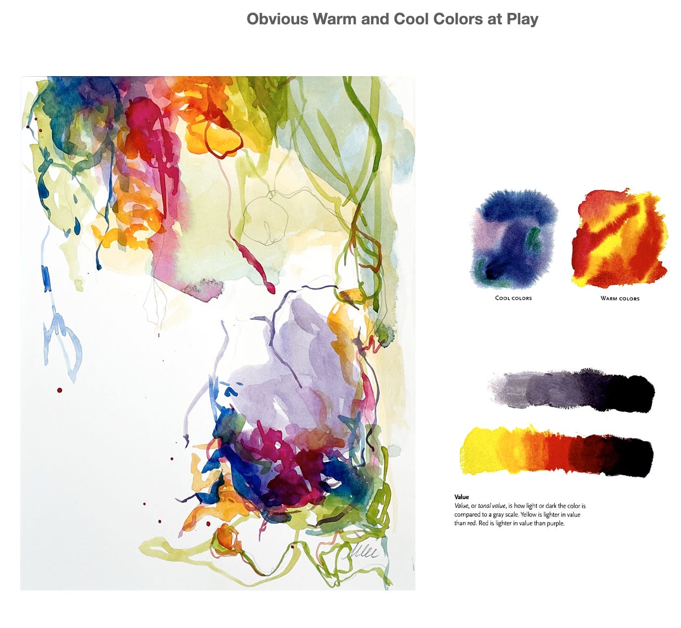
I thought I was taking a color chance by bringing a grouping of paintings with a sensual palette to the show: pinks mingled with reds aside fleshy peaches.
Then, one of my more lush paintings was bought by a young woman who needed new energy in her house and believed having it in her space would inspire her boyfriend to propose. Another piece sold to someone who wanted to make room for a possible mate in her life. I felt as if I was the Godmother of Romance. And this was from women who did NOT know me! They felt something, and color helped them express their desire.

I know that color sets the stage. It can stir, tickle, sway, and make us feel.
Color can set the stage and reign as the star of the show.
I have been exploring "The Way In" as a means artists employ to step into the work that gives them continuity and originality. If you saw Michael's post on contrast, you can see how combining refined color and decisive contrast creates magic.

I encountered Jade Fadojutimi, a young British contemporary artist, at the Venice Biennale. When I searched for her art once I returned home, I was delighted to see how her portfolio is laid out by "color."
The class I am currently teaching, Exploring Abstraction in Watercolor, covers 3 subjects: using watercolor as a medium, exploring the idea of Abstraction as a genre, and an artist's "Way In." That's a lot in 5 weeks as I pull together my chef salad of artistic ideas. Yet, my overarching message in anything I approach for myself, a student, or mentoring is how you capture and express originality.
When tapping into your personal wealth of originality, a path can be paved to use multiple mediums, and it can lend a continuity of work that will flow from your studio.
If you want to learn more about what I cover in the class, subscribe as a yearly member at $48. That’s it! I will start sharing slides, discussing ideas, and delivering demo videos to paid subscribers in late October. It is a new way of offering some teaching on this easy platform to people interested in it. Just hit the subscribe button to take you to your pay options.
So, what are your thoughts on artists supremely motivated by the use and play of color? We can all agree Rothko was obsessed, but I would also add Josef Albers to the list. Here is another slide from class where I dropped in a few shots from The Fall fashion collection from The Row, where they used Alber's juxtaposition of color in their minimal design aesthetic. You see such a minimal use of color in fashion right now. Red is the one color star of the season, so I loved The Row's contrasting shades in the coat and glove.

I am thrilled to be right back at it in the studio, enlarging some of the juicy color palettes that have also left me a bit obsessed, possibly making art that a future fashion house will use as a jumping-off point one day ;)

Hope you enjoyed today’s article. If you think someone else might enjoy this too, feel free to share this article and spread the word. If you have feedback, please comment below! ~ Until next time, Monica
Hello Monica! I just discovered your Substack today and I’m so glad I did! I’m not an artist per se but I am absolutely driven my colour! I’m an interior design student (and early childhood teacher by day) and here on Substack I share how I’ve been using artificial intelligence to explore colourful joyful interiors. Lately I’ve been focusing more and more on colour palettes. I look forward to diving into more of your work!